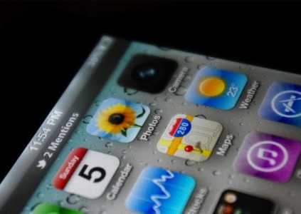
With less than a day before the launch of WWDC 2011, here we have a possible image of how the future operating system from Apple will look. So far, no one has confirmed the authenticity of the image, but those from Techcrunch I argue that the way Twitter is integrated there is close to the general idea presented in the rumors so far. The status bar in iOS has been enlarged to display the mentions made on Twitter in relation to our username, the icon of the Camera application seems to have been slightly changed and there seems to be a new application in the Utilities folder. Normally, there are 4 icons in the Utilities folder, but Apple seems to have added a new one, green, about which we know absolutely nothing.
Could it be? Is this it? iOS 5?! I honestly have absolutely no clue. But it certainly seems like it could at least have the right idea.
Before you go yelling "fake" on the obvious things, a couple notes. First of all, yes, 11:54 PM is in the future — in the United States. But if the Weather app is to be believed, this is clearly a European version of iOS (note the 23 degree Celsius in the icon instead of 72 degree Fahrenheit as you would see in the US). Second, the Camera app icon is totally different, and looks a little odd being all-black, but who knows, maybe it's changing. The icons are in the "correct" default order. Finally, if the talk of deep Twitter integration into iOS 5 is to be believed (we heard a bit, others have heard a bit more), it's entirely possible that these new-style Twitter notifications could be working in iOS 5 right out of the box.
Those from TechCrunch claim that the image above could represent quite well how iOS 5 will look, but for now no one knows for sure. It will be interesting to see how the interaction with the top bar where the mentions appear and it would be great if pressing the status bar would open a slide down panel and not the official Twitter application. It is very curious why the Camera application suddenly became black and why there is a 5th application in the utilities folder. We will definitely find out the answer to these questions tonight.


Camera pictograma schimbata = 8 megapixeli= iphone 4s. Oricum acelasi meniu obositor.
Nu cred. Adica sper sa nu arate asa, ca asta inseamna ca nu au bagat nici-un widget… :(. Si asta ar fi cam rau. Toata lumea se asteapta la widget-uri.
Nu inseamna ca nu ai bagat widget-uri insa fundalul ala ma cam lasa rece. Ori e un mock-uk facut pe iOS 4 ori iOS 5 nu va aduce schimbari importante la design.
N-am mai spus de fundal… ca de fiecare data cand au lansat un nou os au venit cu un alt fundal
Sa speram ca ii mai face cv ca deja p aceeasi linie de 5 ani incoace e cam nasol,adik androidu a evoluat destul d mult fata de 2008…si ca widgeturi s alte chestii e mai bine cotat decat ios,intradevar sincronizarea dintre soft s hardware la android lasa d dorit,p cand apple cu chestia asta inca tine multa lume:),sa speram ca vor asculta de cerintele clientilor s vom avea chestii faine:D
“Oricum acelasi meniu obositor.” c’mooon men nu iti place treci pe alceva, vrei sa arate ca wp7 cu 4 patrate pt tot ecranul? priveste un pic din perspectiva, springboard-ul iPhone-ului este cel mai curat, bine aranjat, spatios, simplu, vezi totul foarte clar pe el, meniul cu setari este simplu, intuitiv.
Vrei sa arate altfel… altfel cum?
daaaaahhh poate sa fie asa PUTIN mai animat,sa prezinte anumete statusuri live aham patratele wp 7-lui,poate un mic widget(un notes/calendar/internet widget macar atat)
Iconita aceea “verde” din folderul Utilities este aplicatia “Find My iPhone”. presupun! 😛
Daca nu tine pasul la partea de soft Apple o sa regrete, doar nu vrem sa ne aminteasca de inertul symbian, sau sa ne vindem idevice-urile pentru ceva ce ruleaza Android.
Sunday 5th 🙂 = iunie 5 = iOS 5 =?!?
din ce vad pana acum….cu toate ca ne asteptam toti la un ios cu UI schimbat….presimt ca o sa fie la fel, probabil functii noi si cam atat 🙁
iMessage e iconita ai verde de la Utilities!
e bine ca va merge si pe 3gs 🙂