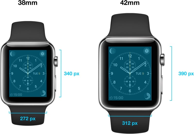
Apple Watch is a new and special product for the Apple company, so that in order to provide the best user experience for it, the Apple company created a writing, font, specially called San Francisco. This is not the first San Francisco font made by the Apple company, but it is specially designed to be displayed as correctly as possible on both versions of the watch, which have different screens and resolutions. This special writing was necessary to be able to display all types of notifications and information on the watch screen as correctly as possible, viewing content on such small screens not being possible in great conditions at any time.
The system font was designed specifically for legibility on Apple Watch. At large sizes, the font's slightly condensed letters are set tight to take up less horizontal space. But at small sizes, they are spaced more loosely and have bigger apertures in glyphs like 'a' and 'e' to make these easier to read at a glance. Punctuation is also proportionally larger when the font gets smaller. And as text size changes, Apple Watch dynamically switches between fonts to maintain clarity and legibility at all times.
In the quote above, Apple explains why its font for the Apple Watch is so special and why it was necessary for users to have it in order to benefit from the best information viewing experience. The Apple Watch has two screens of 38mm and 42mm, the first of them having a resolution of 340 x 272 pixels, while the second has a resolution of 390 x 312 pixels, so displaying the elements on the screen required the development of a special font.


